The Problem with Raw Hyperlinks: Why Dashboards Need Visual Buttons
In digital dashboard design, visual hierarchy dictates how quickly users find what they need. In Notion, standard web links appear as underlined blue text or bulky bookmark embeds that occupy excessive vertical height.
When designing client portals, student hubs, or company knowledge bases, team members miss critical links because they blend into body paragraphs. A prominent, beautifully styled action button creates an immediate visual anchor.
It signals importance, invites interaction, and transforms passive reading documents into active operational cockpits.
Micro-Component Craft: Tactile Lift and Seamless Integration
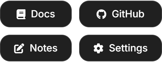
The Button widget is engineered as an ultra-compact interactive action trigger. It features smooth micro-hover elevation, subtle click compression, crisp typography, and support for custom icons and destination URLs.
Adhering strictly to platform design rules, it features zero outer drop shadows and balanced 1px borders that harmonize with Notion's interface. Whether configured with sharp 4px corners for an architectural look or 16px rounded geometry for modern warmth, it delivers a refined navigation portal across both light and dark workspaces.
Four Dashboard Navigation Protocols
Client Portal Primary Call-to-Action
Position a high-contrast button at the top of client onboarding pages labeled 'Submit New Project Request' or 'Book Strategy Call' to guide clients immediately toward priority actions.
Daily External Tool Launchpad
Create dedicated launch buttons for your team's most frequent external services (Figma, GitHub, Linear, Google Drive) directly within your team dashboard header.
Multi-Column Dashboard Navigation Bar
Stack several buttons horizontally across a 4-column Notion section to build an elegant website-style navigation header that links to major wiki subpages.
Color Palette Harmonization
Match the button theme to your page's cover image: select Dark Luxury for gold accents, Emerald for financial dashboards, or Notion Dark for seamless minimalism.
Architectural Breakdown: Visual Widget vs. Standard Notion Link
Database Tables & Records
Best for deep historical storage, relations, and structured records